
Background
A couple of weeks ago I did a Google Forms survey asking questions about how increments in India work.
If you want to read the original posts, you can find them here:
This blog post documents some of the insights gathered from that survey. This is a long post, but that’s because it’s mostly charts, and they take space 😄
How to read this document
In order to make this post manageable (both for myself and for the reader) and prevent endless scrolling, I’ve used collapsible elements for the charts and sections below. All you need to do is click the black arrow/triangle bullet point at every section header, and it will open up to reveal the content inside.
Data Cleaning
If you took the survey, you might have noticed that most of the questions had an open text field - even the questions with yes/no answers had a third “other” option where you could write in something else.
This was in order to prevent my biases from seeping into the questionnaire, and at the same time to allow people to describe things the way they wanted. Predictably, this led to a large amount of disparate data (e.g. the variations in designation for “Software Engineer” were SE, SWE, Software Engineer, Engineer-1, Android Developer, Software Developer, etc)
In order to publish data that is more valuable, and (without meaning any offense) less noisy, I have taken the liberty to sanitize the data (for example: all the above designations fold into “Software Engineer”). There’s one more reason for doing this - privacy.
While I do not know the which response belongs to whom (my friends seem to have kept their companies undisclosed, very rational 🙂), your friends might know that you’ve contributed to the questionnaire. Some of the responses, because they are unique, could lead to people being able to guess who the respondent was. In order to prevent that, I have also clubbed similar responses where possible.
Analysis
Before we move on to the numbers, it will be useful to understand the basic background of the people (and their companies) who’ve graciously responded to the post.
All in all we received 52 responses. One of those barely had any sensible information, so it was discarded from analysis.
Company Information
For privacy considerations, I will not be publishing information about which companies responded, because there’s a large number of companies where the response count is two or less. However, the other facets below might help understand the data.
Click on the black triangle/arrow to read more in the section
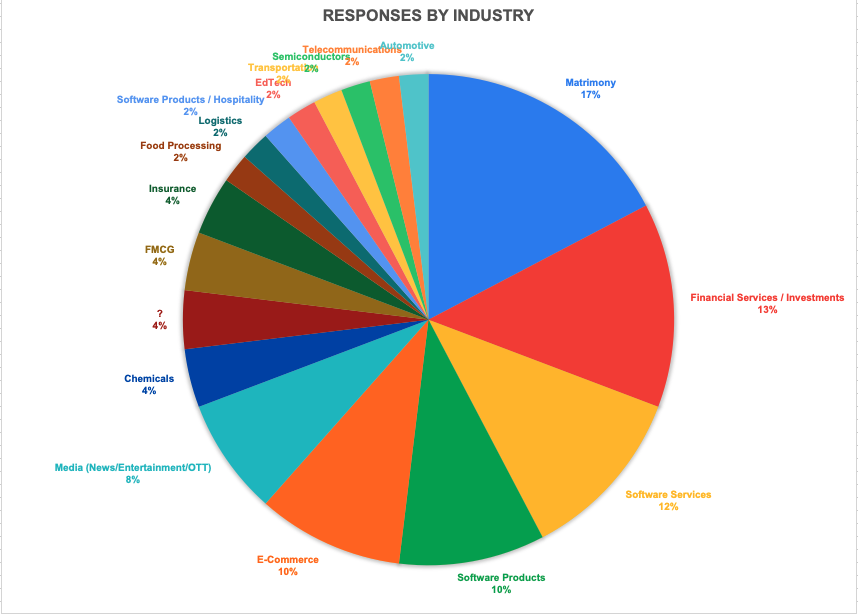
Responses by Industry
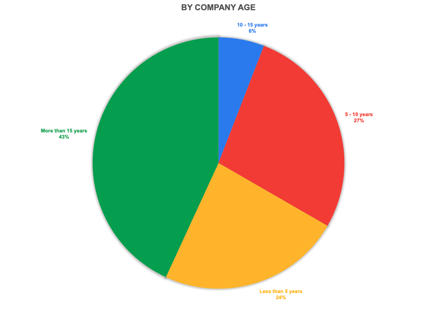
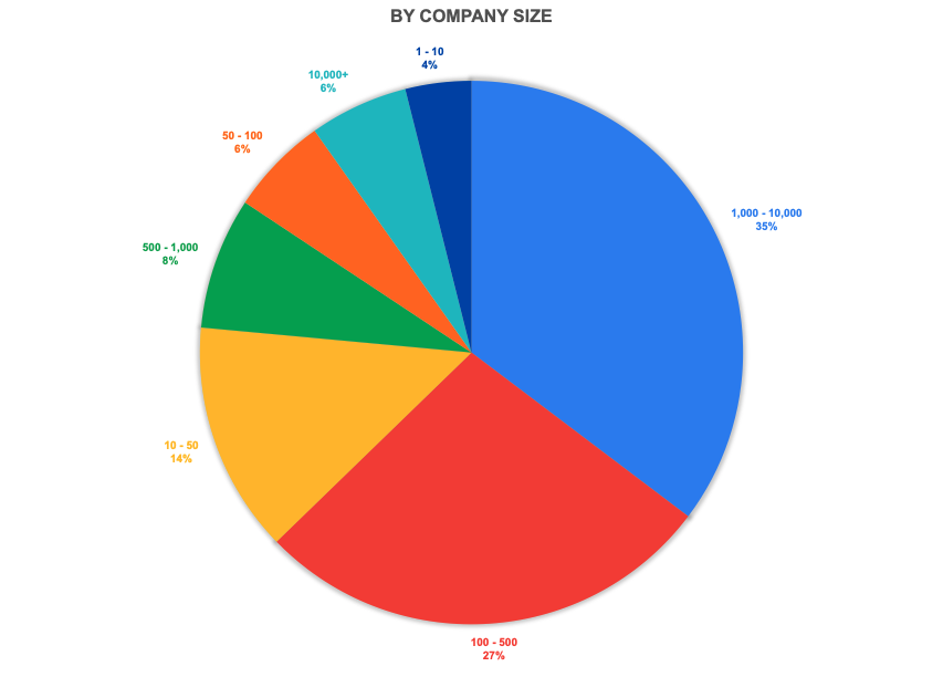
Nearly half of the responses were from well-established companies (10 years or more). Nearly 25% of all responses were from early startups (less than 5 years). A similar bias is seen towards larger companies (by employee count) in the responses.
Responses by Company Age and Size
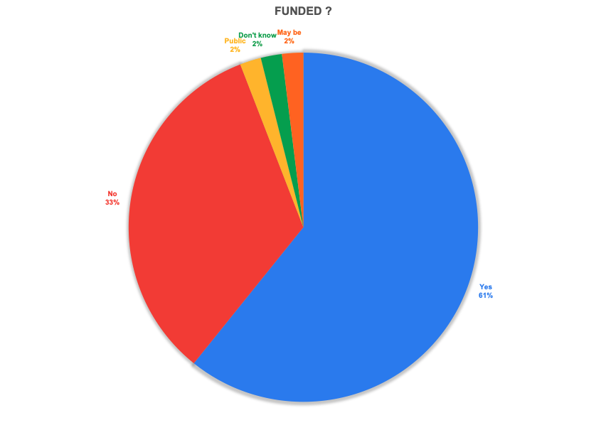
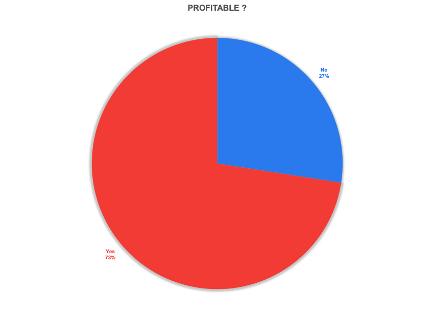
Almost 60% of responses were from funded companies. However, an even larger number was from profitable companies. I’ll admit that this caught me by surprise.
Funding and Profitability
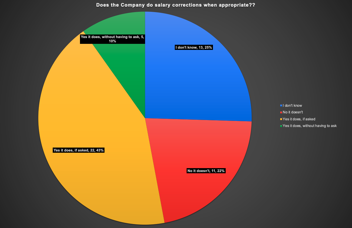
Does the company do salary corrections?
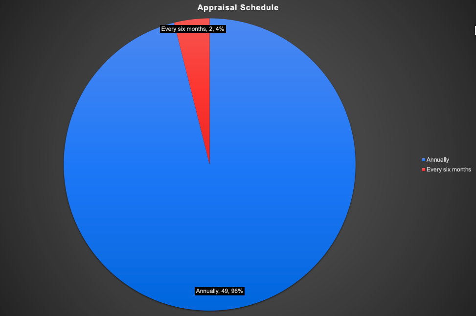
Appraisal Schedule
Demographic Information
About the people themselves…
Click on the black triangle/arrow to read more in the section
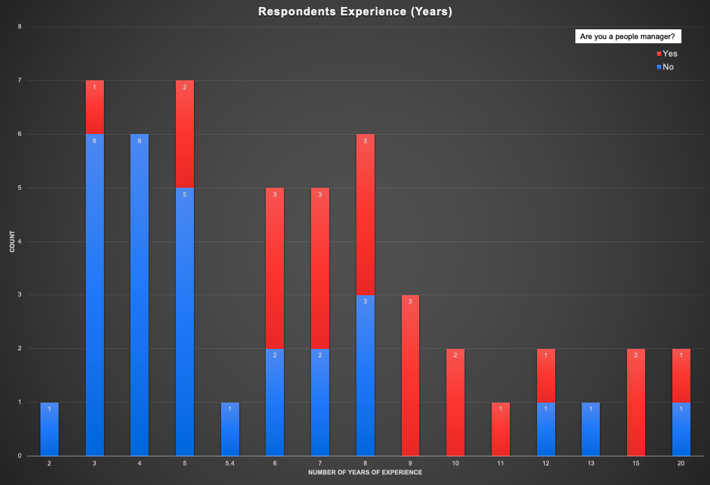
The reds are people who are managers, blue are individual contributors. Most of the responses have come from the 3 to 8 years range. Also, though this is a ridiculously small sample set to base any inference on, the proportion of managers is higher with more experienced people (duh 🤷).
Distribution of responses by number of years of experience
Qualification
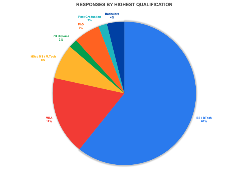
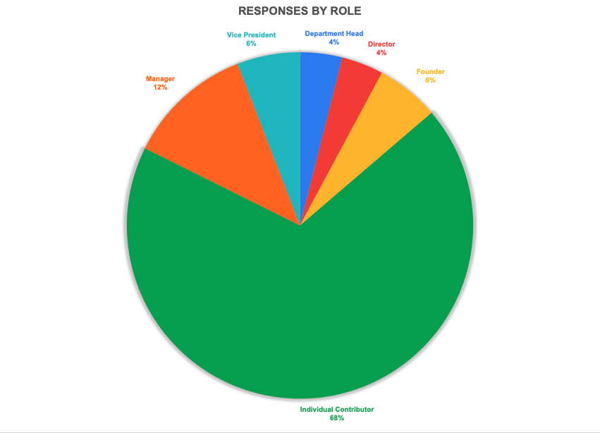
Two thirds of the responses were Individual Contributors. This is an interesting data point, because it tells me a couple of things: For designations, over half of the respondents were software engineer ICs. I have also combined some more designations into the same grouping where appropriate. That said, there were a few which didn’t directly fall into any group, so I kept them as is.
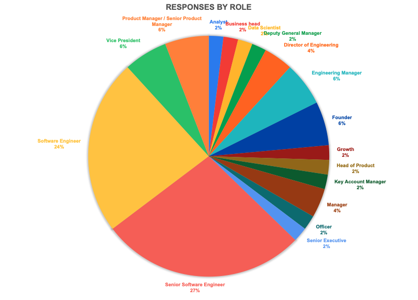
Role and Designation
Here it is
Increments
Finally, to the meat of the matter!
A little note here: As explained earlier, all responses were text fields of the type “8-10%”. I manually separated out the min and max for each performance category. There were 2-3 cases where a min/max was not provided but a reasonable estimate was possible. In those cases I’ve supplied an approximate value. For some other cases where it wasn’t possible, I have assumed “no data”.
We’ll start with the basics first - increments by performance category, and then try to delve deeper in order to understand the results better.
Click on the black triangle/arrow to read more in the section
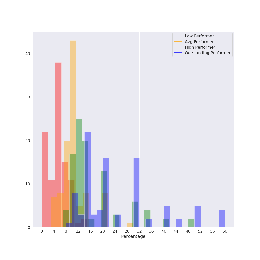
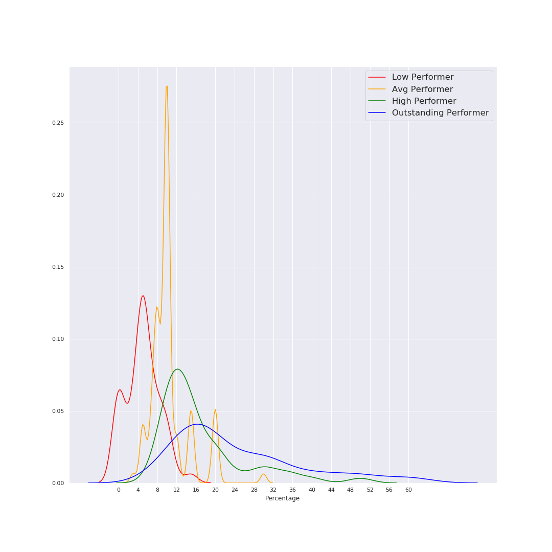
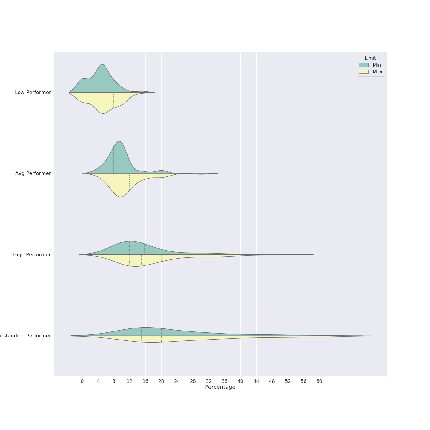
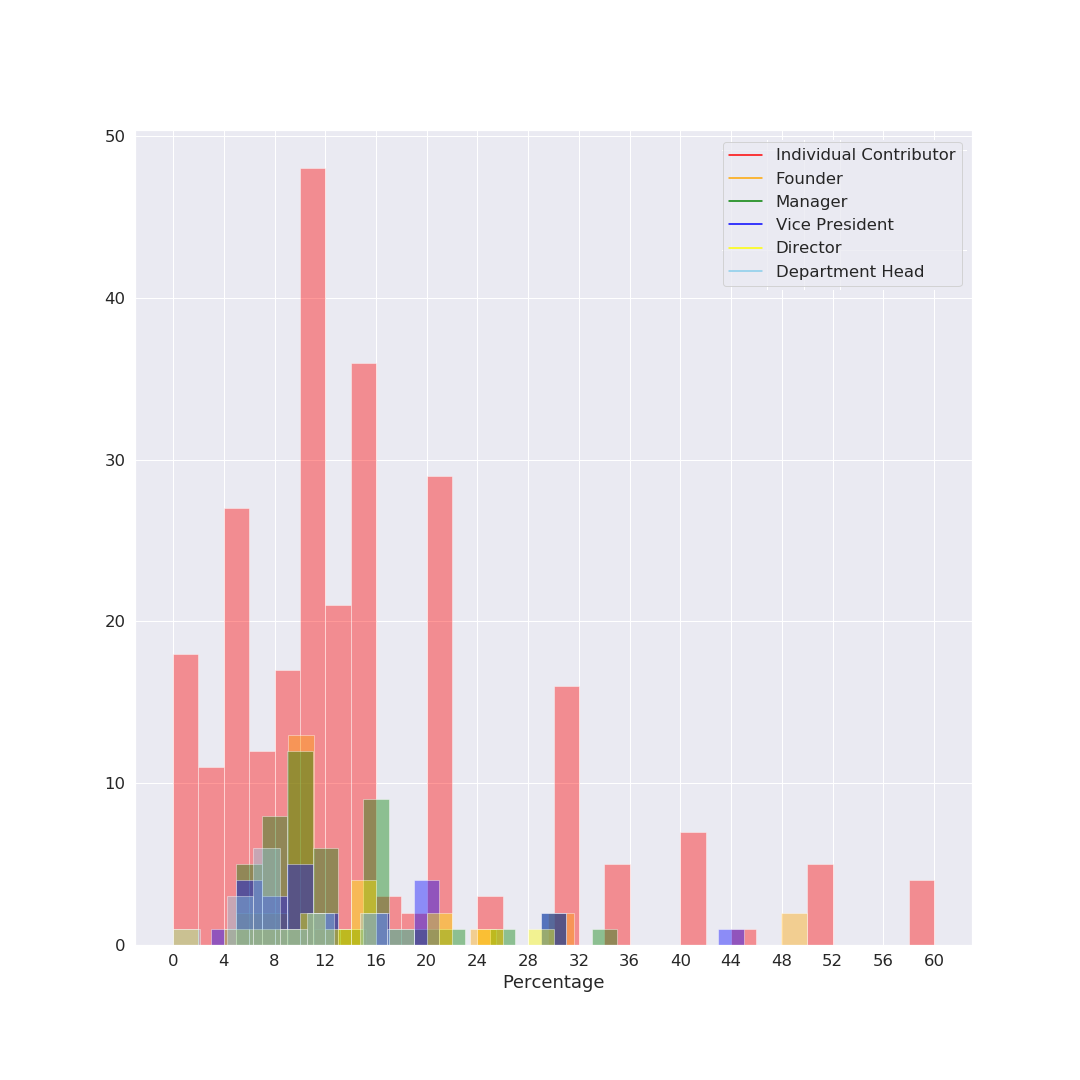
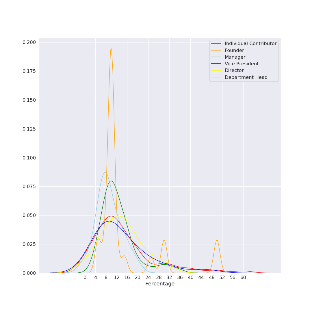
I tried to come up with a good visualization for showing this information coherently – and since it was a while I’d used python+seaborn for data viz, I got carried away and tried a bunch of different things. I’m sharing all the charts below - they all say the same thing (give or take), you can read the ones you are most comfortable with. Fig 1: Histogram The simplest one to understand is a histogram. However, there’s way too much overlap, which makes it harder to read. X axis is the percentage increment, Y axis is the counts (number of occurrences of each % number). As you might see, 5% and 10% are clear favorites (which makes sense given our tendency and liking to have nice round numbers). Fig 2: Line chart (KDE function) Basically the same histogram, programmatically converted to a smooth line chart. Note that in this case, the Y axis is not the count, just the relative occurrence. Other than the lack of counts, this chart might be the simplest to read. We can clearly see that the red (Low Performer) peak is left-most at ~5%, followed by Average at ~10%, High at ~12% and Outstanding just a bit higher at 16%. Note that these are modes; the actual range of numbers was super wide. For example there were actually a couple of entries for 50-60% increments (‼️) for outstanding performers, so just looking at the peaks might not paint the correct picture. (As a side note, I personally believe 50-60% increments might actually be signs of a pay and/or role correction, not an actual “annual increment”, but that’s just my opinion) Fig 3: Violin Plot This is one of my favorite charts, for multiple reasons. If you look closely, there is much more information to be drawn out here:
Increments by Performance Category
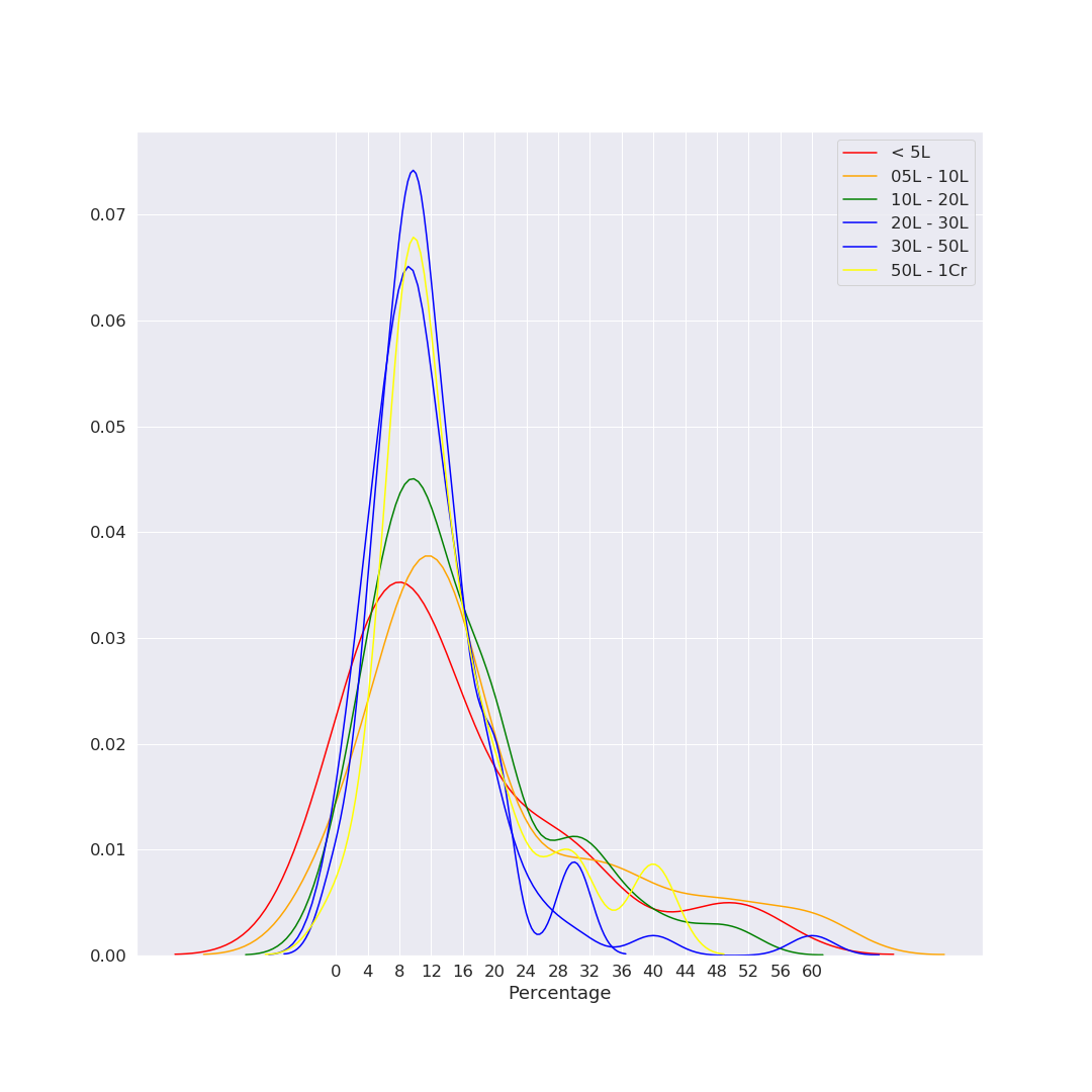
This was surprising for me. I expected significant deviation here, but it seems from the KDE plot that (at least in our sample set), the employee’s current salary does not significantly affect % changes. (histogram and violin plots weren’t very legible, so we’ll stick with this plot here)
Increments Distribution by Salary Range
It would seem from the histogram below that ICs score the most of the high increments, but do remember that two-thirds of our respondents were ICs, so the data is likely biased for that (esp. if you were comparing counts across categories). It might be more useful to consider each independently, so we use the KDE plot (below). Here also, surprisingly, it seems that the peaks are pretty much aligned around 10%. Do note that this is not further segregated by performance category.
Increments Distribution by Role
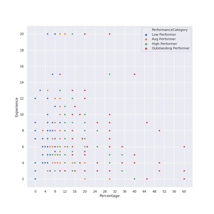
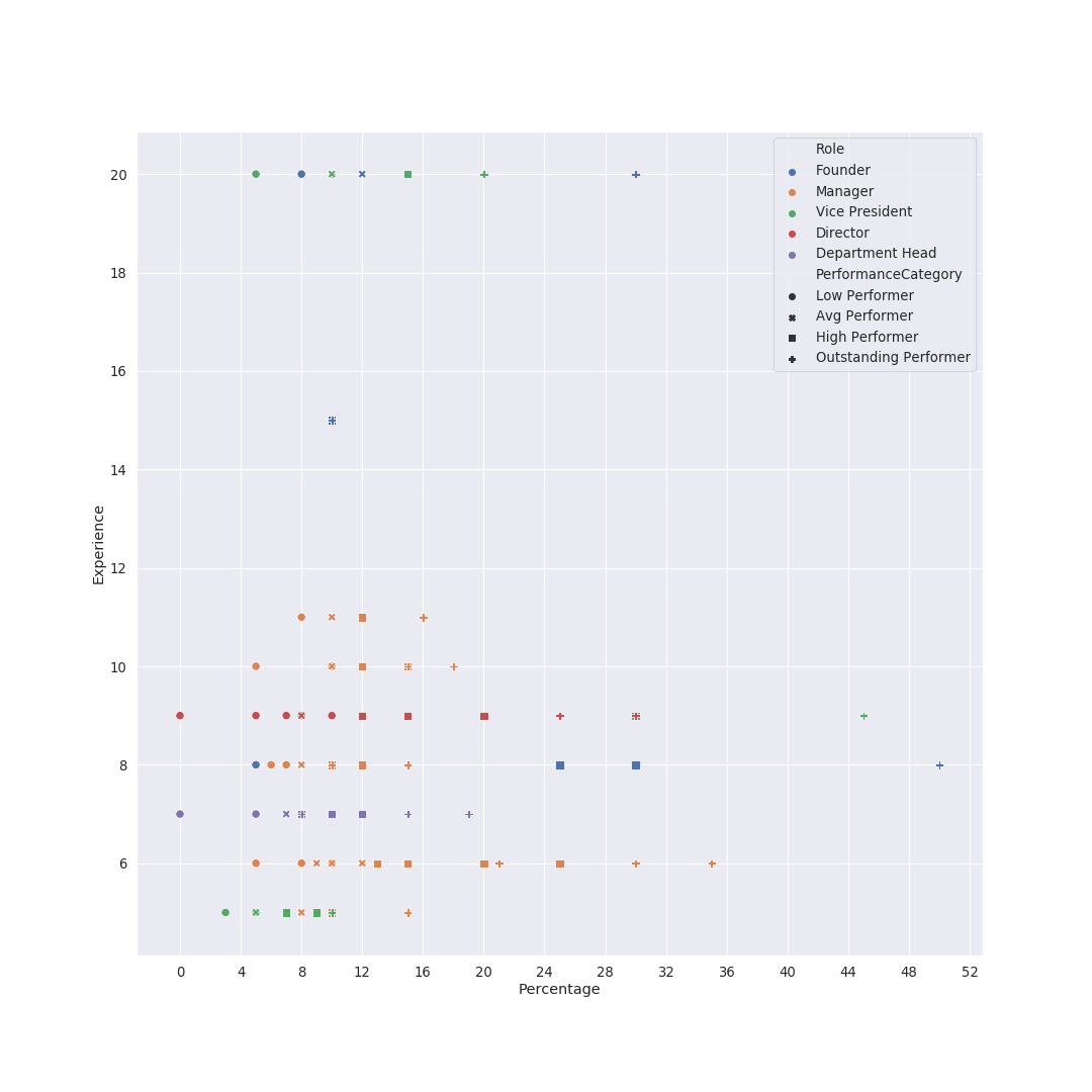
The natural next question to ask is: do the increments change with time (years of experience) ? In my head, they would taper down (because 20-30% increases every year would probably compound to a hell lot of money, especially given tech salaries these days. Let’s see what the data says… We plot the percentage increment on the X axis, as previously done. Additionally, we plot the Experience (years) on the Y axis. The dots are color coded by performance category, as shown in the legend. Observations: Now that we have this chart, we could use it to study other characteristics… See next section.
Increments Distribution by Experience + Performance Category
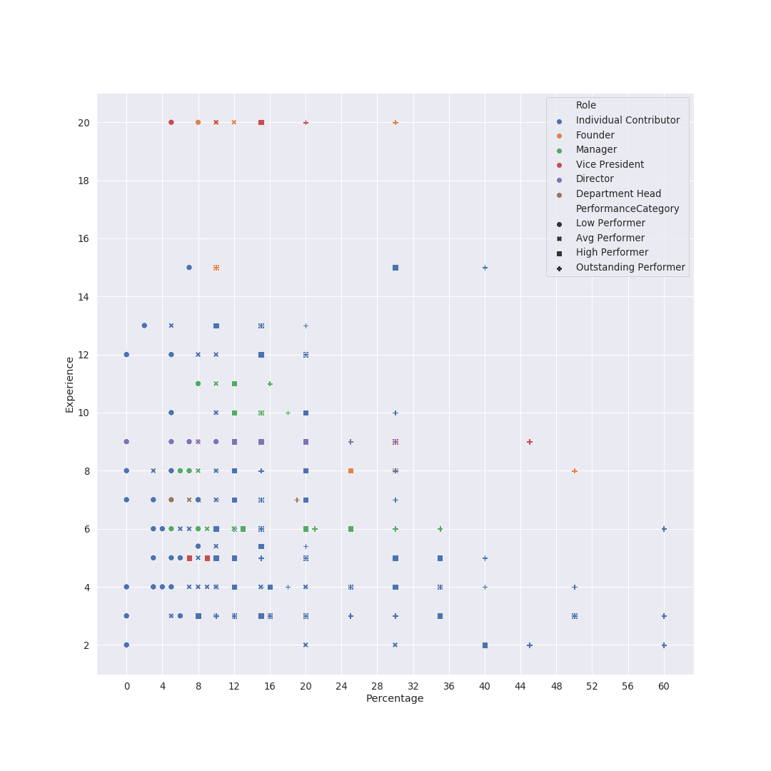
Once again using the scatter plot, with X as percentage, Y as experience, and using colors and shapes for role and performance respectively. Personally, I found it too overwhelming, so I filtered out the ICs, and the chart becomes relatively readable. Two things I notice are:
Increments Distribution by Experience + Performance Category + Role
I tried doing the same analysis with designation, but there’s too many of them, couldn’t make much sense out of it.
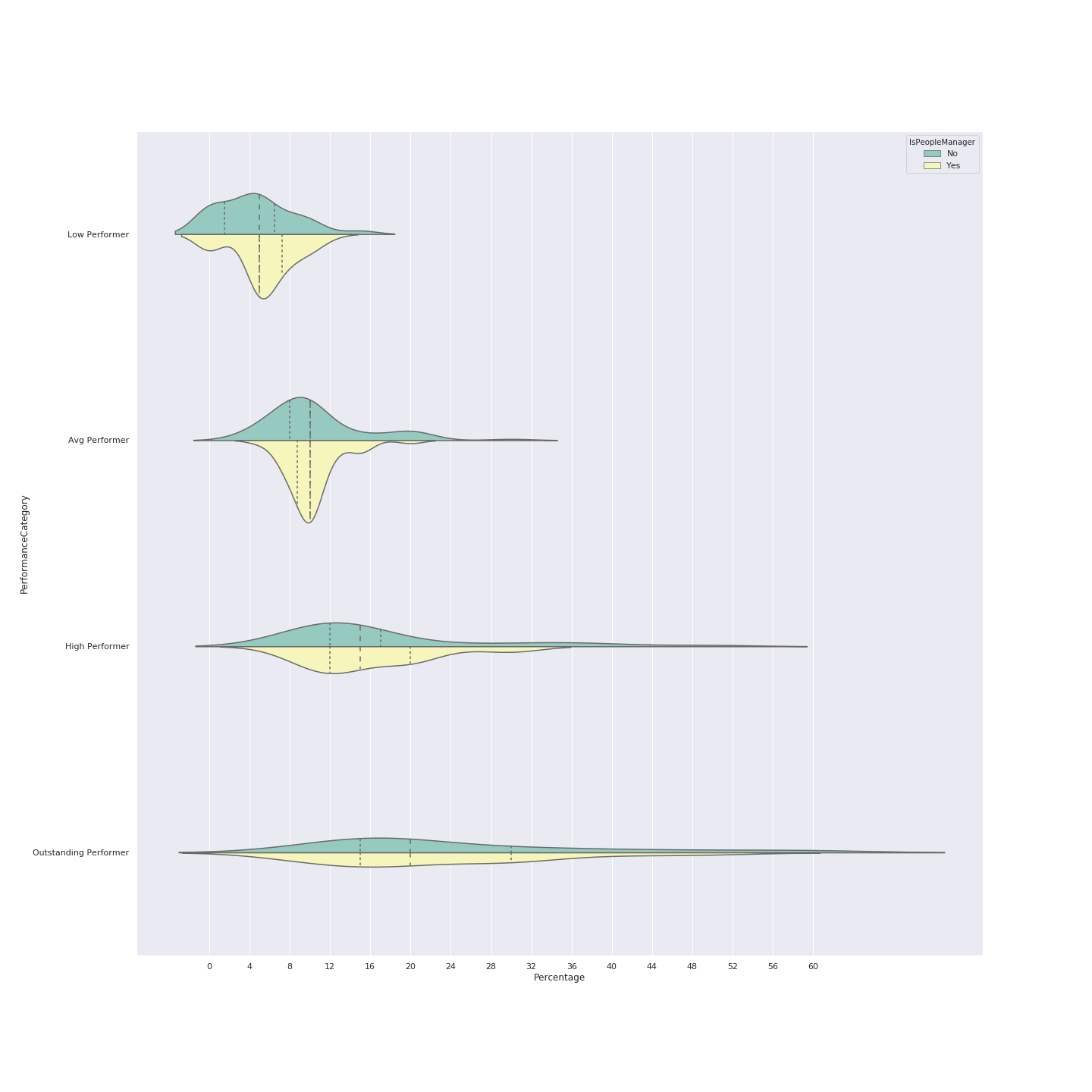
I do have one more violin chart for performance and manager-vs-IC, but I’m myself not very sure how to read it. If you want to take a shot:
Here it is
Next Steps and Conclusion
I’m sure there could be a few more insights that could be wrangled out of the data we have. A couple of examples would be
- Include some of the bonus related questions
- Include some of the great text/sentence based responses received as a part of the exercise
- etc
Though at the moment time does not permit me to indulge myself more here. I will update this page if/when I get it.
Lastly, the data from 50+ people confirms what I learnt from 5 (personal conversations). There are a lot of differences in what various people and companies consider as reasonable increments (probably based on their individual, unshared experiences?). “To each their own” might be the way to go for now.
Though I think it might be worthwhile to do this at a larger scale in the future, to see if there’s convergence.
Special Mentions
This post was graciously reviewed by Kunal Patil who made great suggestions for additions to the increments section, and by Annkur Agarwal.
Also hat tip to the Shaadi.com team for being the largest source of responses (by company) – enthusiasm is very appreciated, folks!